ConstraintLayout约束布局
ConstraintLayout约束布局
之前的课程里并没有给大家讲ConstraintLayout,因为有同学说多方便呀,拖拽就好了。重点在这,拖拽呀!!!
其实呀,布局除了用xml写以外,还可以使用Java写,效率高。但是呢,阅读性不好。所以大家就使用xml来写了,再通过inflater转在对应的Java类。
现在做得跟VB一样,直接拖拽了。
ConstraintLayout有啥好处呢?可以减少布局层次,特别适合复杂的大型布局。可谓是集线性布局和相对布局于一身的荣誉布局。
视图拖拽的方式这里就不详细眼大家说了,拖拽用视频比较好表达,同学们看视频吧。这里主要是代码的编写。这样看来,我觉得这博客同学们自己完全可以自己写呀。
官方文档
添加依赖
目前,AndroidStudio新的版本默认就给你上ConstraintLayout了。如果没有的话怎么添加以来呢?
 repositories {
        google()
    }
添加仓库依赖
 dependencies {
        implementation 'com.android.support.constraint:constraint-layout:1.1.2'
    }
然后就sync一下就好了。
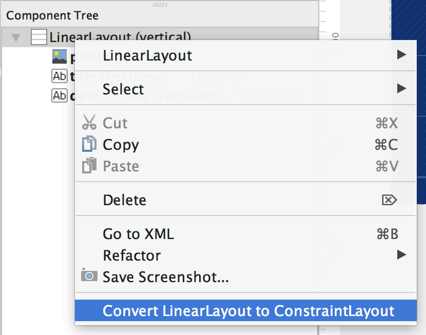
把现有的布局转成约束布局
1、在 Android Studio 中打开您的布局,然后点击编辑器窗口底部的 Design 标签。
2、在 Component Tree 窗口中,右键点击该布局,然后点击 Convert layout to ConstraintLayout。
ConstraintLayout有什么属性呢?
layout_constraintLeft_toLeftOf
layout_constraintLeft_toRightOf
layout_constraintRight_toLeftOf
layout_constraintRight_toRightOf
layout_constraintTop_toTopOf
layout_constraintTop_toBottomOf
layout_constraintBottom_toTopOf
layout_constraintBottom_toBottomOf
layout_constraintBaseline_toBaselineOf
layout_constraintStart_toEndOf
layout_constraintStart_toStartOf
layout_constraintEnd_toStartOf
layout_constraintEnd_toEndOf
layout_constraintCircle
layout_constraintCircleRadius
layout_constraintCircleAngle
layout_editor_absoluteX
layout_editor_absoluteY
layout_constraintGuide_begin
layout_constraintGuide_end
layout_constraintGuide_percent
layout_goneMarginLeft
layout_goneMarginTop
layout_goneMarginRight
layout_goneMarginBottom
layout_goneMarginStart
layout_goneMarginEnd
layout_constraintHorizontal_bias
layout_constraintVertical_bias
layout_constraintDimensionRatio
layout_constraintHorizontal_weight
layout_constraintVertical_weight
layout_constraintHorizontal_chainStyle
layout_constraintVertical_chainStyle
layout_constrainedWidth
layout_constrainedHeight
layout_constraintWidth_default
layout_constraintHeight_default
layout_constraintWidth_min
layout_constraintWidth_max
layout_constraintWidth_percent
layout_constraintHeight_min
layout_constraintHeight_max
layout_constraintHeight_percent
layout_constraintLeft_creator
layout_constraintTop_creator
layout_constraintRight_creator
layout_constraintBottom_creator
layout_constraintBaseline_creator
创建约束布局的规则
- 每个视图都必须至少有两个约束条件:一个水平约束条件,一个垂直约束条件
- 只能在共用同一平面的约束手柄与定位点之间创建约束条件。因此,视图的垂直平面(左侧和右侧)只能约束在另一个垂直平面上;而基准线则只能约束到其他基准线上。
- 每个约束句柄只能用于一个约束条件,但您可以在同一定位点上创建多个约束条件(从不同的视图)
接下来我们就对这些布局拆分讲解,然后把以前的布局转成ConstraintLayout,虽然可以自动转,但是我们得手写,okay吧。
布局
相对布局
相对布局有哪些属性呢?
layout_constraintLeft_toLeftOf
layout_constraintLeft_toRightOf
layout_constraintRight_toLeftOf
layout_constraintRight_toRightOf
layout_constraintTop_toTopOf
layout_constraintTop_toBottomOf
layout_constraintBottom_toTopOf
layout_constraintBottom_toBottomOf
layout_constraintBaseline_toBaselineOf
layout_constraintStart_toEndOf
layout_constraintStart_toStartOf
layout_constraintEnd_toStartOf
layout_constraintEnd_toEndOf
相对布局熟悉吧,我们使用RelativeLayout,现在使用约束布局也类似,也就是在谁谁的什么地方。
前面我们有规则,只能在共用同一平面的约束手柄与定位点之间创建约束条件。不过还好,有属性名称,基本不会错。
- 相对于父级
<?xml version="1.0" encoding="utf-8"?>
<androidx.constraintlayout.widget.ConstraintLayout
    xmlns:android="http://schemas.android.com/apk/res/android"
    xmlns:app="http://schemas.android.com/apk/res-auto"
    xmlns:tools="http://schemas.android.com/tools"
    android:layout_width="match_parent"
    android:layout_height="match_parent">

    <Button
        android:id="@+id/button"
        android:layout_width="wrap_content"
        android:layout_height="wrap_content"
        android:text="Button"
        app:layout_constraintStart_toStartOf="parent"
        app:layout_constraintTop_toTopOf="parent" />

</androidx.constraintlayout.widget.ConstraintLayout>
比如说这样子,顶部相对于父级的顶部约束,开始的位置跟父级开始的位置一样。
这里
app:layout_constraintStart_toStartOf="parent"
也可以换成这个,理解起来一样的。
app:layout_constraintLeft_toLeftOf="parent"
那left跟start有什么区别呢?
left一定是左边,start不一定是左边。明白了吗?
我们的习惯是start从左往右,比如说文字阅读。而某些国家是start从右往左。这个开始方向是跟系统语言有关系的。
知道这个,同学们应该知道怎么写了吧。
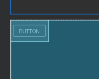
如果我左边约束于父级的左边,右边约束于父级的右边,顶部约束于父级的顶部,底部约束于父级的底部会怎么样呢?
    <Button
        android:id="@+id/button"
        android:layout_width="wrap_content"
        android:layout_height="wrap_content"
        android:text="Button"
        app:layout_constraintBottom_toBottomOf="parent"
        app:layout_constraintLeft_toLeftOf="parent"
        app:layout_constraintRight_toRightOf="parent"
        app:layout_constraintTop_toTopOf="parent" />
比如说这样子,那么它的布局是怎么样子的呢?
居中于父控件了
- 同级的相对布局
跟前面一样,我们有
    <Button
        android:id="@+id/button"
        android:layout_width="wrap_content"
        android:layout_height="wrap_content"
        android:text="Button"
        app:layout_constraintBottom_toBottomOf="parent"
        app:layout_constraintLeft_toLeftOf="parent"
        app:layout_constraintRight_toRightOf="parent"
        app:layout_constraintTop_toTopOf="parent" />

    <Button
        android:layout_width="wrap_content"
        android:layout_height="wrap_content"
        android:text="button2"
        app:layout_constraintLeft_toLeftOf="@id/button"
        app:layout_constraintTop_toBottomOf="@id/button" />
同样的,在左边,右边,顶部,底部,baseLine这些都可以。角度的我们后面再说。
 <Button
        android:layout_width="wrap_content"
        android:layout_height="wrap_content"
        android:text="button2"
        app:layout_constraintLeft_toLeftOf="parent"
        app:layout_constraintBaseline_toBaselineOf="@id/button"/>

这个用得比较上,主要还是上下右边约束。
上下左右同学们都很熟悉,那baseLine基线,什么是基线呢?
    /**
     * <p>Return the offset of the widget's text baseline from the widget's top
     * boundary. If this widget does not support baseline alignment, this
     * method returns -1. </p>
     *
     * @return the offset of the baseline within the widget's bounds or -1
     *         if baseline alignment is not supported
     */
    @ViewDebug.ExportedProperty(category = "layout")
    @InspectableProperty
    public int getBaseline() {
        return -1;
    }
get一下不就知道了吗?
这就是基线
the offset of the widget's text baseline from the widget's top boundary.
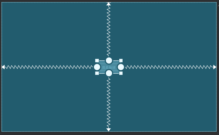
居中
居中我们前面拖拽完事了
    <Button
        android:id="@+id/earth"
        android:layout_width="wrap_content"
        android:layout_height="wrap_content"
        android:text="我是地球"
        app:layout_constraintBottom_toBottomOf="parent"
        app:layout_constraintTop_toTopOf="parent"
        app:layout_constraintLeft_toLeftOf="parent"
        app:layout_constraintRight_toRightOf="parent" />
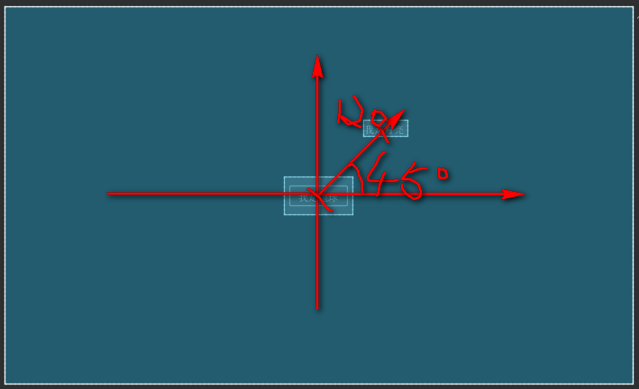
角度定位
相关属性
//围绕的目标
layout_constraintCircle
//距离
layout_constraintCircleRadius
//角度
layout_constraintCircleAngle
例子:
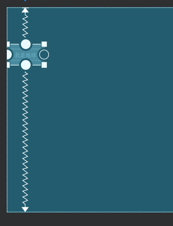
月球围着地球转
    <Button
        android:id="@+id/earth"
        android:layout_width="wrap_content"
        android:layout_height="wrap_content"
        android:text="我是地球"
        app:layout_constraintBottom_toBottomOf="parent"
        app:layout_constraintLeft_toLeftOf="parent"
        app:layout_constraintRight_toRightOf="parent"
        app:layout_constraintTop_toTopOf="parent" />

    <TextView
        android:id="@+id/textView"
        android:layout_width="wrap_content"
        android:layout_height="wrap_content"
        android:layout_marginStart="13dp"
        android:layout_marginBottom="51dp"
        android:text="我是月亮"
        app:layout_constraintBottom_toTopOf="@+id/earth"
        app:layout_constraintCircle="@id/earth"
        app:layout_constraintCircleAngle="45"
        app:layout_constraintCircleRadius="120dp"
        app:layout_constraintStart_toEndOf="@+id/earth" />
绝对布局
相关属性
layout_editor_absoluteX
layout_editor_absoluteY
代码:
    <Button
        android:id="@+id/earth"
        android:layout_width="wrap_content"
        android:layout_height="wrap_content"
        android:layout_marginStart="100dp"
        android:layout_marginTop="100dp"
        android:text="我是地球"
        app:layout_constraintStart_toStartOf="parent"
        app:layout_constraintTop_toTopOf="parent"
        app:layout_editor_absoluteX="100dp"
        app:layout_editor_absoluteY="100dp" />
Margin
这个太简单了,相信大家都知道怎么用的,前面也有相关的值的。
相关属性
layout_goneMarginLeft
layout_goneMarginTop
layout_goneMarginRight
layout_goneMarginBottom
layout_goneMarginStart
layout_goneMarginEnd
这个直接略过吧
理解一个点就好,start跟right的区别,right一定是right,而start不一定是左,也不一定从左往右,看是哪个国家。有些国家是从右到左的。
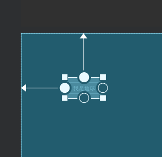
偏移
bias就是偏移的意思,这个同学们可以见得少。
相关属性
layout_constraintHorizontal_bias
layout_constraintVertical_bias
水平偏移和垂直偏移
来例子
    <Button
        android:id="@+id/earth"
        android:layout_width="wrap_content"
        android:layout_height="wrap_content"
        android:text="我是地球"
        app:layout_constraintHorizontal_bias="0.2"
        app:layout_constraintLeft_toLeftOf="parent"
        app:layout_constraintRight_toRightOf="parent"
        app:layout_constraintTop_toTopOf="parent" />
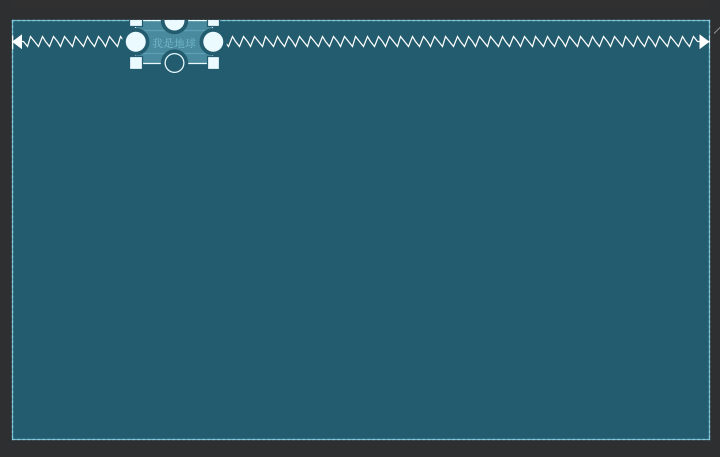
垂直方向
    <Button
        android:id="@+id/earth"
        android:layout_width="wrap_content"
        android:layout_height="wrap_content"
        android:text="我是地球"
        app:layout_constraintVertical_bias="0.2"
        app:layout_constraintBottom_toBottomOf="parent"
        app:layout_constraintLeft_toLeftOf="parent"
        app:layout_constraintTop_toTopOf="parent" />
宽高比
相关属性
layout_constraintDimensionRatio
如果我们要一下1:2的控件大小
    <Button
        android:id="@+id/earth"
        android:layout_width="100dp"
        android:layout_height="0dp"
        android:text="我是地球"
        app:layout_constraintBottom_toBottomOf="parent"
        app:layout_constraintDimensionRatio="1:2"
        app:layout_constraintLeft_toLeftOf="parent"
        app:layout_constraintRight_toRightOf="parent"
        app:layout_constraintTop_toTopOf="parent" />
宽高至少得有一个为0,则以另外一个值作为参考进行比例。
权重
这个大家熟悉,线性布局里用到过是吧。
相关属性
layout_constraintHorizontal_weight
layout_constraintVertical_weight
水平方向的权重,垂直方向的权重
先来个案例
    <Button
        android:id="@+id/button1"
        android:layout_width="0dp"
        android:layout_height="wrap_content"
        android:text="button1"
        app:layout_constraintHorizontal_weight="1"
        app:layout_constraintLeft_toLeftOf="parent"
        app:layout_constraintRight_toLeftOf="@id/button2"
        app:layout_constraintTop_toTopOf="parent" />

    <Button
        android:id="@+id/button2"
        android:layout_width="0dp"
        android:layout_height="wrap_content"
        android:text="button2"
        app:layout_constraintHorizontal_weight="2"
        app:layout_constraintLeft_toRightOf="@id/button1"
        app:layout_constraintRight_toRightOf="parent"
        app:layout_constraintTop_toTopOf="parent" />
垂直方向同样的用法
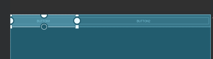
链式布局
卧槽,新东西,是吧!哈哈
相关属性
layout_constraintHorizontal_chainStyle
layout_constraintVertical_chainStyle
所以这个官方里也更多描述这个
链
图文并茂,链接已经在文章开头给到大家了
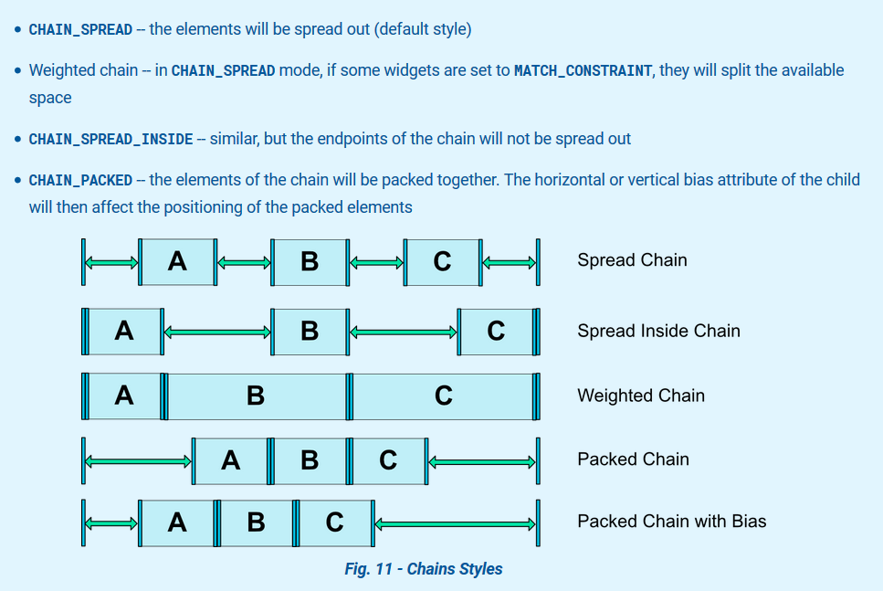
通俗易懂的翻译(看图说话)
- CHAIN_SPREAD 左右两边距离相等
- CHAIN_SPREAD_INSIDE 内边距相关
- Weighted chain 权重链,根据权重占比
- CHAIN_PACKED 两边等距内容一起
- package chain with bias 同上,不过有偏移
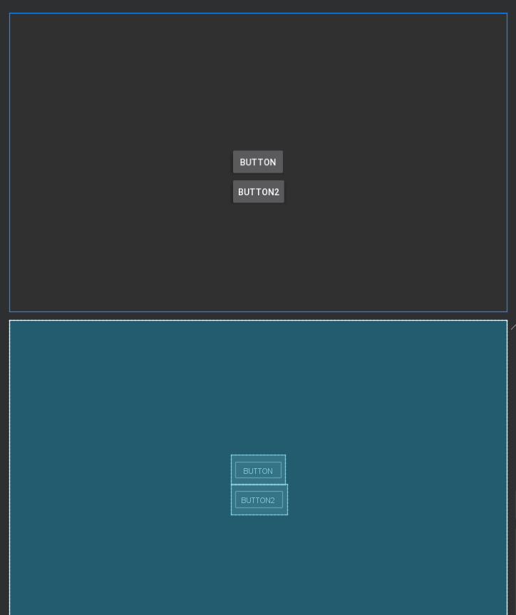
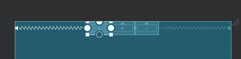
看案例吧
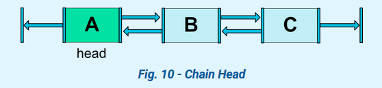
第一步:先写出链关系,如这图
代码:
    <Button
        android:id="@+id/button1"
        android:layout_width="wrap_content"
        android:layout_height="wrap_content"
        android:text="A"
        app:layout_constraintLeft_toLeftOf="parent"
        app:layout_constraintRight_toLeftOf="@id/button2"
        app:layout_constraintTop_toTopOf="parent" />

    <Button
        android:id="@+id/button2"
        android:layout_width="wrap_content"
        android:layout_height="wrap_content"
        android:text="B"
        app:layout_constraintLeft_toRightOf="@id/button1"
        app:layout_constraintRight_toLeftOf="@id/button3"
        app:layout_constraintTop_toTopOf="parent" />


    <Button
        android:id="@+id/button3"
        android:layout_width="wrap_content"
        android:layout_height="wrap_content"
        android:text="C"
        app:layout_constraintLeft_toRightOf="@id/button2"
        app:layout_constraintRight_toRightOf="parent"
        app:layout_constraintTop_toTopOf="parent" />
然后在链头添加样式:
app:layout_constraintHorizontal_chainStyle="packed"
app:layout_constraintHorizontal_chainStyle="spread_inside"
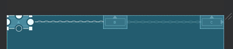
app:layout_constraintHorizontal_chainStyle="spread"
默认的就这个样了,我不截图了
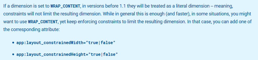
尺寸约束
这个一看就会了吧,
相关属性
layout_constrainedWidth
layout_constrainedHeight
layout_constraintWidth_default
layout_constraintHeight_default
layout_constraintWidth_min
layout_constraintWidth_max
layout_constraintWidth_percent
layout_constraintHeight_min
layout_constraintHeight_max
layout_constraintHeight_percent
- layout_constrainedWidth
这个约束宽度
体会一下:
false
<Button
android:id="@+id/button1"
android:layout_width="wrap_content"
android:layout_height="wrap_content"
android:text="A"
app:layout_constraintHorizontal_chainStyle="spread"
app:layout_constraintLeft_toLeftOf="parent"
app:layout_constraintRight_toLeftOf="@id/button2"
app:layout_constraintTop_toTopOf="parent" />
<Button
android:id="@+id/button2"
android:layout_width="wrap_content"
android:layout_height="wrap_content"
android:text="B"
app:layout_constraintLeft_toRightOf="@id/button1"
app:layout_constraintRight_toLeftOf="@id/button3"
app:layout_constraintTop_toTopOf="parent" />
<Button
android:id="@+id/button3"
android:layout_width="wrap_content"
android:layout_height="wrap_content"
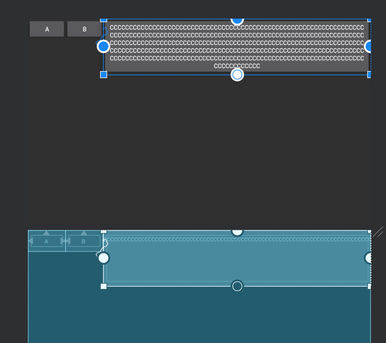
android:text="CCCCCCCCCCCCCCCCCCCCCCCCCCCCCCCCCCCCCCCCCCCCCCCCCCCCCCCCCCCCCCCCCCCCCCCCCCCCCCCCCCCCCCCCCCCCCCCCCCCCCCCCCCCCCCCCCCCCCCCCCCCCCCCCCCCCCCCCCCCCCCCCCCCCCCCCCCCCCCCCCCCCCCCCCCCCCCCCCCCCCCCCCCCCCCCCCCCCCCCCCCCCCCCCCCCCCCCCCCCCCCCCCCCCCCCCCCCCCCCCCCCCCCCCCCCCCCCCCCCCCCCCCCCCCCCCCCCCCCCCCCCCCCCCCCCCCCCCCCCCCCCCCCCCCCCCCCCCCCCCCCCCCCCCCCCCCCCCCCCCCC"
app:layout_constraintLeft_toRightOf="@id/button2"
app:layout_constraintRight_toRightOf="parent"
app:layout_constraintTop_toTopOf="parent" />
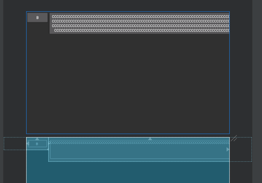
true,约束宽度
layout_constrainedHeight 同理
layout_constraintWidth_default,layout_constraintWidth_percent
layout_constraintWidth_default值选项有三,是枚
定义如下:
    <attr name="layout_constraintWidth_default">
        <enum name="spread" value="0"/>
        <enum name="wrap" value="1"/>
        <enum name="percent" value="2"/>
    </attr>
主要用于设置百分比
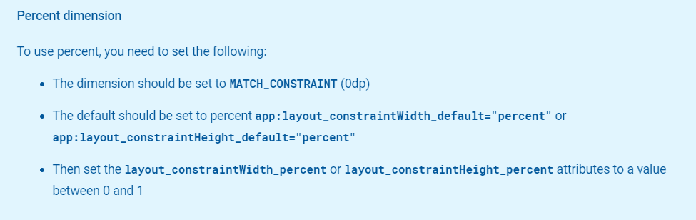
- 宽度为0dp
- layout_constraintWidth_default为percent
- 通过layout_constraintHeight_percent 或者layout_constraintWidth_percent 来设置百分比
同样的用法有:
layout_constraintHeight_percent和layout_constraintHeight_default
最值限定
layout_constraintWidth_min
layout_constraintWidth_max
layout_constraintHeight_min
layout_constraintHeight_max
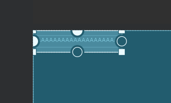
若内容是动态内容 ,此时为包裹内容会动态变化宽高,可以通过以上几个属性来限定控件的宽高变化。
    <Button
        android:id="@+id/button1"
        android:layout_width="0dp"
        android:layout_height="wrap_content"
        android:text="AAAAAAAAAAAAAAAAAAAAAAAAAAAAAAAAAAAAAAAAAAAAAAAAAAAAAAAA"
        app:layout_constraintLeft_toLeftOf="parent"
        android:maxHeight="30dp"
        app:layout_constraintTop_toTopOf="parent"
        app:layout_constraintWidth_max="200dp" />
creator约束
相关属性
layout_constraintLeft_creator
layout_constraintTop_creator
layout_constraintRight_creator
layout_constraintBottom_creator
layout_constraintBaseline_creator
我的版本是2.0.0-beta5
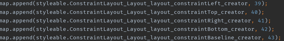
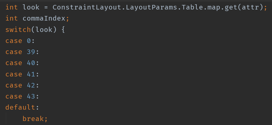
这些属性代码上没有使用到。设计造火箭,编码拧螺丝。
辅助约束
Virtual Helper objects
参考线
可以理解为一个假设的线,实际运行时不会出现。只是你看预览的时候会有。
相关属性
//开始
layout_constraintGuide_begin
//结束
layout_constraintGuide_end
//百分比
layout_constraintGuide_percent
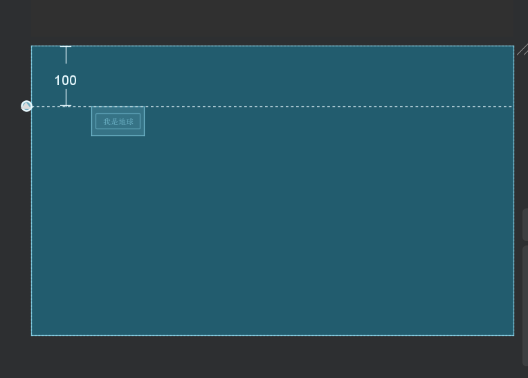
例子:
开始距离
    <androidx.constraintlayout.widget.Guideline
        android:layout_width="wrap_content"
        android:layout_height="wrap_content"
        app:layout_constraintGuide_begin="100dp"/>
方向,默认是水平方向
    <androidx.constraintlayout.widget.Guideline
        android:layout_width="wrap_content"
        android:orientation="vertical"
        android:layout_height="wrap_content"
        app:layout_constraintGuide_begin="100dp"/>
改成垂直方向,如上
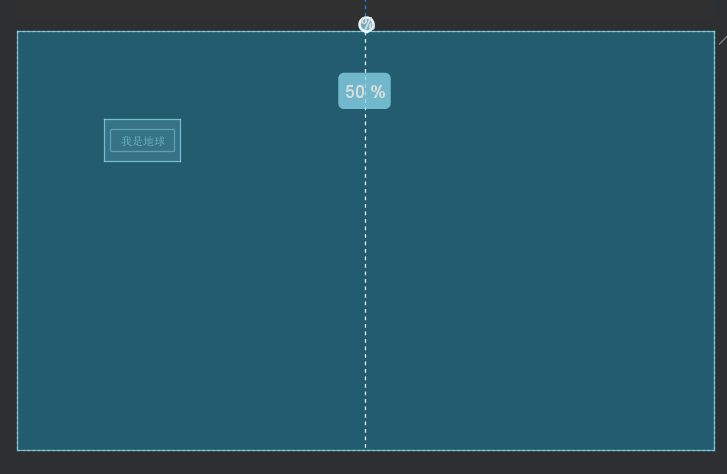
百分比,注意,取值[0,1]f
    <androidx.constraintlayout.widget.Guideline
        android:layout_width="wrap_content"
        android:orientation="vertical"
        android:layout_height="wrap_content"
        app:layout_constraintGuide_percent="0.5"/>
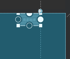
使用,参考于guide_line
    <androidx.constraintlayout.widget.Guideline
        android:id="@+id/guide_line"
        android:layout_width="wrap_content"
        android:layout_height="wrap_content"
        android:orientation="vertical"
        app:layout_constraintGuide_end="100dp" />

    <Button
        android:id="@+id/earth"
        android:layout_width="wrap_content"
        android:layout_height="wrap_content"
        android:text="我是地球"
        app:layout_constraintRight_toRightOf="@+id/guide_line"
        app:layout_constraintTop_toTopOf="parent" />
Optimizer
属性定义:
    <attr name="layout_optimizationLevel">
        <flag name="none" value="0"/>
        <flag name="standard" value="7"/> <!-- direct, barriers, chains -->
        <flag name="direct" value="1"/>
        <flag name="barrier" value="2"/>
        <flag name="chains" value="4"/>
        <flag name="dimensions" value="8"/>
        <flag name="ratio" value="16"/>
        <flag name="groups" value="32"/>
        <flag name="graph" value="64"/>
        <flag name="graph_wrap" value="128"/>
    </attr>
- none 无优化
- standard 标准优化,默认项,优化内容:直接约束和barrier约束
- direct 优化内容:真接约优化
- barrier 优化内容:屏障优化
- chain 优化内容:链优化
- dimensions 优化尺寸测量
屏障Barrier
这个什么情况用呢?
如下case,以下布局:
    <TextView
        android:id="@+id/text1"
        android:layout_width="wrap_content"
        android:layout_height="wrap_content"
        android:padding="30dp"
        android:text="1111111111111111111"
        app:layout_constraintLeft_toLeftOf="parent"
        app:layout_constraintTop_toTopOf="parent" />

    <TextView
        android:id="@+id/text2"
        android:layout_width="wrap_content"
        android:layout_height="wrap_content"
        android:layout_marginTop="20dp"
        android:padding="30dp"
        android:text="22222222222"
        app:layout_constraintLeft_toLeftOf="parent"
        app:layout_constraintTop_toBottomOf="@id/text1" />

    <TextView
        android:layout_width="wrap_content"
        android:layout_height="match_parent"
        android:text="333333333333333333333333333333333"
        app:layout_constraintLeft_toRightOf="@id/text1"
        app:layout_constraintTop_toTopOf="parent" />
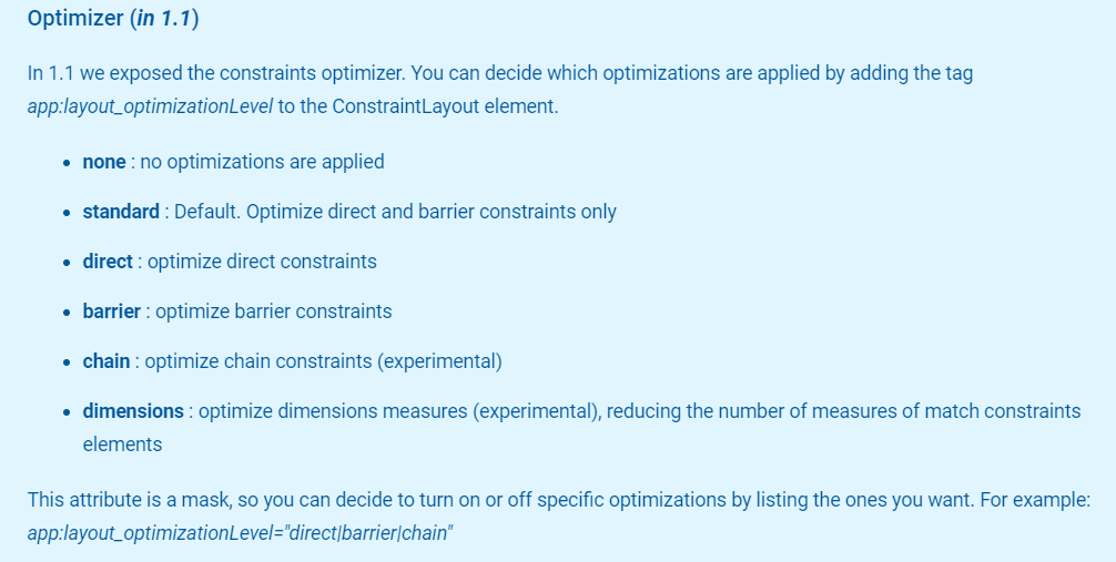
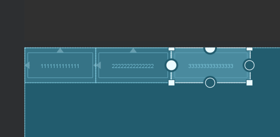
左边的1和2都是包裹内容,内容动态添加的话会撑大。目前3是以1的右边作为参考。如果2变大,则会与3重叠
这显句不符合我们的要求,那怎么办呢?
设立一道屏障即可。
<TextView
android:id="@+id/text1"
android:layout_width="wrap_content"
android:layout_height="wrap_content"
android:padding="30dp"
android:text="1111111111111111111"
app:layout_constraintLeft_toLeftOf="parent"
app:layout_constraintTop_toTopOf="parent" />
<TextView
android:id="@+id/text2"
android:layout_width="wrap_content"
android:layout_height="wrap_content"
android:layout_marginTop="20dp"
android:padding="30dp"
android:text="22222222222222222222222222222222222222222"
app:layout_constraintLeft_toLeftOf="parent"
app:layout_constraintTop_toBottomOf="@id/text1" />
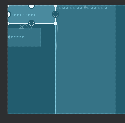
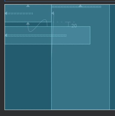
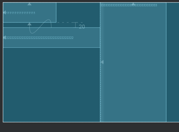
<androidx.constraintlayout.widget.Barrier
android:id="@+id/barrier"
android:layout_width="wrap_content"
android:layout_height="wrap_content"
app:barrierDirection="right"
app:constraint_referenced_ids="text1,text2" />
<TextView
android:layout_width="wrap_content"
android:layout_height="match_parent"
android:text="333333333333333333333333333333333"
app:layout_constraintLeft_toRightOf="@id/barrier"
app:layout_constraintTop_toTopOf="parent" />
这样子,就以屏障作为参考了
Group组
官方文档:
This class controls the visibility of a set of referenced widgets. Widgets are referenced by being added to a comma separated list of ids,
控制一组内容的可见性
<?xml version="1.0" encoding="utf-8"?>
<androidx.constraintlayout.widget.ConstraintLayout xmlns:android="http://schemas.android.com/apk/res/android"
    xmlns:app="http://schemas.android.com/apk/res-auto"
    android:layout_width="match_parent"
    android:layout_height="match_parent"
    app:layout_optimizationLevel="">


    <Button
        android:id="@+id/button1"
        android:layout_width="wrap_content"
        android:layout_height="wrap_content"
        android:padding="30dp"
        android:text="1111111111111"
        app:layout_constraintLeft_toLeftOf="parent"
        app:layout_constraintTop_toTopOf="parent" />

    <Button
        android:id="@+id/button2"
        android:layout_width="wrap_content"
        android:layout_height="wrap_content"
        android:padding="30dp"
        android:text="22222222222222"
        app:layout_constraintLeft_toRightOf="@id/button1"
        app:layout_constraintTop_toTopOf="parent" />

    <Button
        android:id="@+id/button3"
        android:layout_width="wrap_content"
        android:layout_height="wrap_content"
        android:padding="30dp"
        android:text="333333333333333"
        app:layout_constraintLeft_toRightOf="@id/button2"
        app:layout_constraintTop_toTopOf="parent" />

    <androidx.constraintlayout.widget.Group
        android:layout_width="wrap_content"
        android:layout_height="wrap_content"
        app:constraint_referenced_ids="button1,button3" />


</androidx.constraintlayout.widget.ConstraintLayout>
设置不可见
   <androidx.constraintlayout.widget.Group
        android:layout_width="wrap_content"
        android:visibility="gone"
        android:layout_height="wrap_content"
        app:constraint_referenced_ids="button1,button3" />
就只剩下一个了。
Placeholder
学过前端同学知道,这个跟android输入框的hint是不是类似呀
A Placeholder provides a virtual object which can position an existing object.
以前我们一般用FragmetLayout来挖坑,现在可以使用Placeholder来挖坑了,然后 通过setContent的方式,填充内容即可。
末言
okay,到这里我们就基本上把ConstraintLayout搞定了。
这些都是招式,使用的时候,找到合适的招式即可,并不是非得必须使用。
关于拖拽的问题,很多同学习惯拖拽。google的确想做得更简单,让初学者更容易上手。对于有经验的开发人员来说,除了会拖拽,还要会修改xml,能看懂里面的属性有什么作用。