04.Android自定义控件的步骤
Android自定控件的步骤
为什么自定义控件要步骤化呢?因为很多新手同学,根据产品的要求做一些控件时,无从下手。
有了步骤以后,就可以按套路走了,再也不用害怕了。
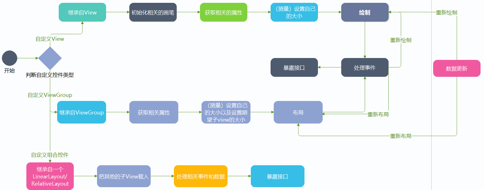
判断控件类型
首先我们要判断这个控件是属于自定义控件里的哪种类型,如果不知道分类的话,同学们可以看这篇文章
获取相关的属性
其实这玩意在自定义控件里叫自定义属性。什么是属性呢?
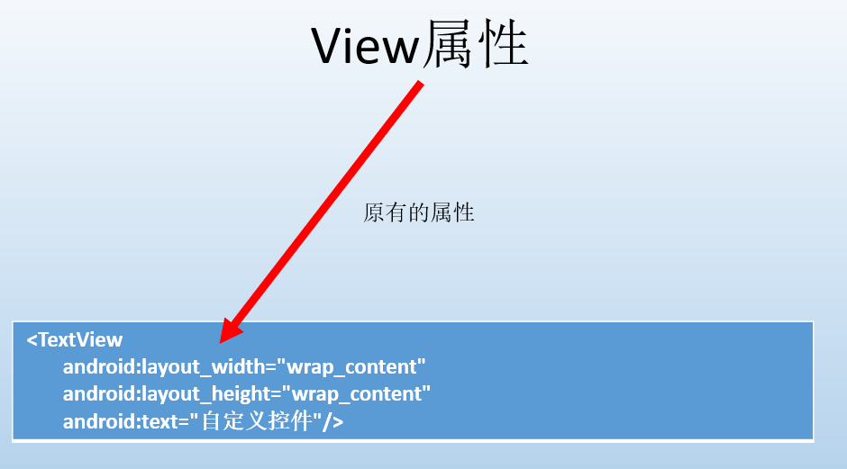
来我们看,android控件原有的属性:
比如说我们的LinearLayout
 <LinearLayout
        android:layout_width="wrap_content"
        android:layout_height="wrap_content"
        android:layout_alignParentBottom="true"
        android:layout_centerHorizontal="true"
        android:layout_marginBottom="41px"
        android:orientation="horizontal">
</LinearLayout>
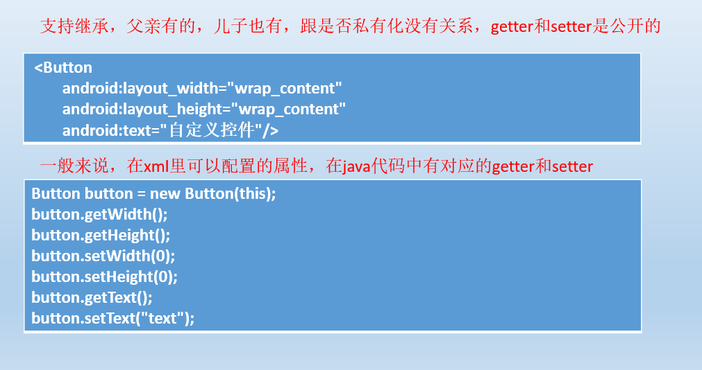
这里面的属性就有origintation,layout_width,layout_height.... 而origintation是LinearLayout特有的,而其他的则是View都有的
那么我们在写自己的控件时,有些值,也是通过xml里的属性进行配置的,所以我们要有自定义属性。
自定义控件里如何自定义属性呢?
自定义属性步骤:
- 声明属性
在attrs.xml里进行声明,其实都行,都是resourse,举例:
    <declare-styleable name="RoundImage_Style">
        <attr name="radius" format="dimension" />
        <attr name="showBorder" format="boolean" />
        <attr name="borderWidth" format="dimension" />
    </declare-styleable>
- 使用属性
    <com.sunofbeaches.calendarproviderdemo.RoundImageView
        android:layout_width="match_parent"
        android:layout_height="match_parent"
        sob:borderWidth="5dp"
        sob:radius="4dp"
        sob:showBorder="true" />
添加命名空间
xmlns:sob="https://schemas.android.com/apk/res-auto"
- 获取属性值
public class RoundImageView extends AppCompatImageView {

    private static final String TAG = "RoundImageView";
    private float mRadius;
    private float mBorderWidth;
    private boolean mShowBorder;

    public RoundImageView(Context context) {
        this(context,null);
    }

    public RoundImageView(Context context,AttributeSet attrs) {
        this(context,attrs,0);
    }

    public RoundImageView(Context context,AttributeSet attrs,int defStyleAttr) {
        super(context,attrs,defStyleAttr);
        TypedArray typedArray = context.obtainStyledAttributes(attrs,R.styleable.RoundImage_Style);
        //一般默认值设置成常量
        mRadius = typedArray.getDimension(R.styleable.RoundImage_Style_radius,0);
        mBorderWidth = typedArray.getDimension(R.styleable.RoundImage_Style_borderWidth,0);
        mShowBorder = typedArray.getBoolean(R.styleable.RoundImage_Style_showBorder,false);
        Log.d(TAG,"mRadius -- > " + mRadius);
        Log.d(TAG,"mBorderWidth -- > " + mBorderWidth);
        Log.d(TAG,"mShowBorder -- > " + mShowBorder);
        typedArray.recycle();
    }
}
运行结果:
 D/RoundImageView: mRadius -- > 12.0
 D/RoundImageView: mBorderWidth -- > 15.0
 D/RoundImageView: mShowBorder -- > true
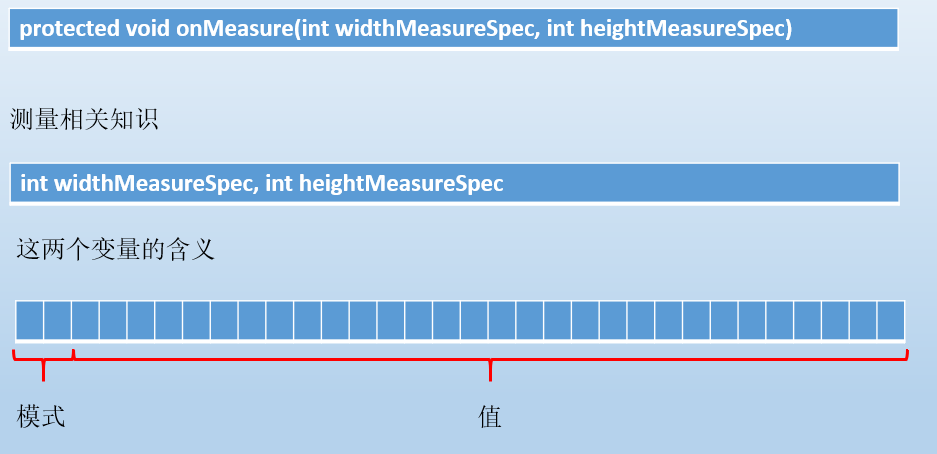
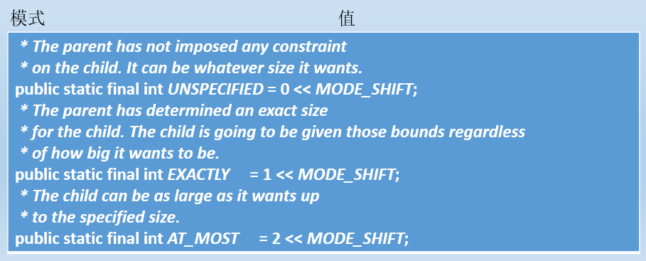
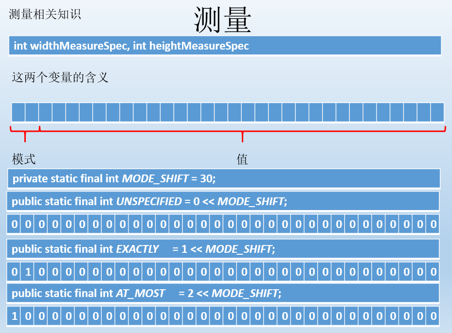
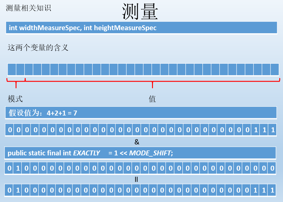
测量
测量是重点要掌握的,如果是ViewGroup则测量自己(设置自己大小,因为ViewGroup也可以是子view呀)跟设置期望孩子的大小。
如果是View则需要测量自己(设置自己大小)
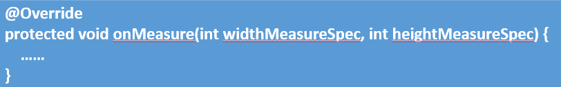
这两个参数要理解
处理事件
一般来说,除了简单的展示性控件,多数控件都要处理事件的。比如说我们上一篇文章的例子:
这是一个ViewGropu,要处理触摸事件吧!当事件触发时,则要重新布局,改变其位置。
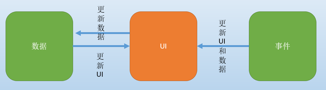
数据更新
数据更新以后,UI也要重新布局,而View则需要重新绘制。
后面呢,我们就根据这个图去走流程,编写一些案例,几个例子下来,相信同学们就可以自己动手去写控件了。
先是模仿,再是去实现自己的想法。
自定义控件的本质